Emerald green and burgundy marbles are two of the richest hues that can be used in bathroom design. For years, the neutral tones dominated, driven by the desire for bright and clean spaces. But a shift is occurring, with homeowners and designers alike looking to infuse their homes with more personality, depth, and a touch of theatricality. The move towards bold, saturated colors is a direct response, and it is booming in the marble industry.
In this article let us explore why emerald green and burgundy marble are used in premium bathroom designs and how they can incorporate this trend into their home.
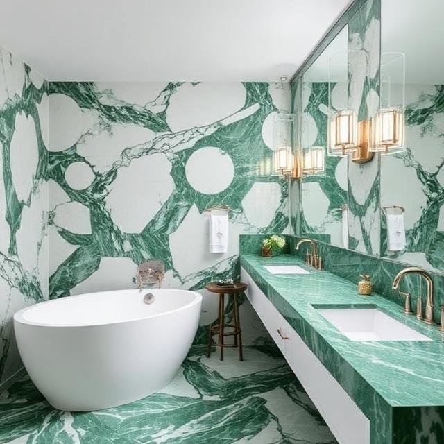
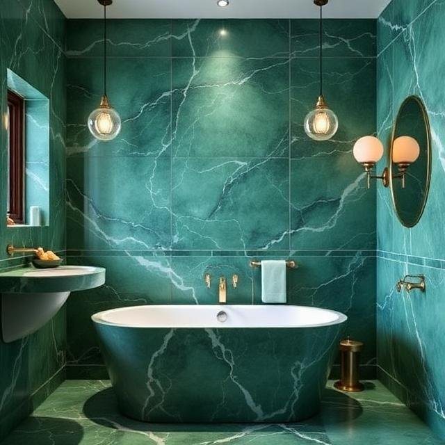
The Allure of Verde Guatemala: More Than Just Green
Emerald Green (Verde Guatemala) is a natural stone with a personality as rich as its name suggests. This stone is not just in a green shade; it is a tapestry of emerald forest and often intersects with a beautiful grey or white veining pattern.
Why It’s a Favorite:
- It’s Nature’s Luxury: Emerald green has a vibrant color that connects to the outdoors in an elevated way. It can evoke the lushness of a tropical forest and the opulence of ancient jade.
- Versatility in Design: Although the marble has a bold color, it plays well with others. It looks stunning, and it can be paired with a high-contrast modern look, wood tones, and antique brass for a more classic feel.
- It Creates a Sanctuary: Emerald green is calming; it can be used in a jewel-tone shade in the bathroom to create a serene, spa-like atmosphere that can still feel incredibly luxurious.
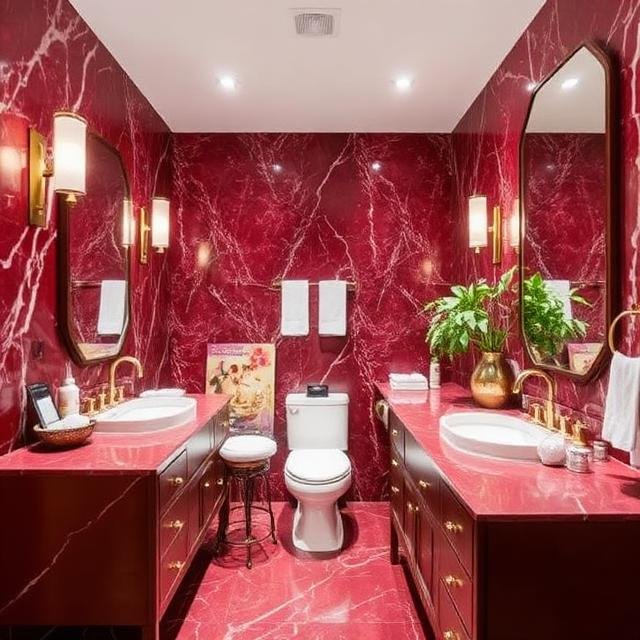
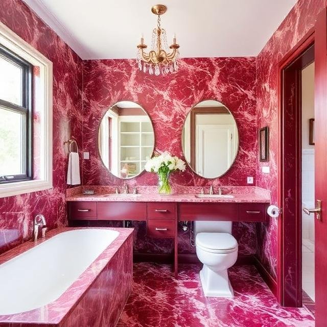
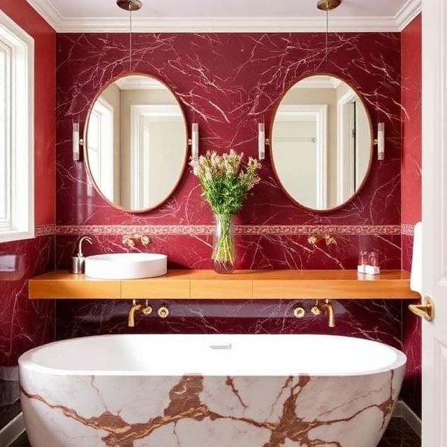
The Drama of Burgundy Marble: Deep, Intense, and Timeless
Burgundy marble is one of the most seasoned dramatic counterparts, known as Rosso Levanto or Cherry Red marble. It has claret and crimson tones and is often dramatically streaked with striking white, grey, and gold veining patterns.
Why It’s a Favorite:
- Unapologetic Opulence: Burgundy marble does not do subtle. It is a stone that attracts; the rich, saturated colors instantly add a sense of history, gravitas, and unparalleled luxury to a space. It feels like it was pulled straight from a Venetian palazzo.
- A New Neutral for the Bold: For those tired of black, burgundy offers a rich, moody alternative and brings the same depth and drama as black but with a warmth and complexity that black sometimes lacks.
- Perfect for Focal Points: Burgundy marble is fantastic for creating high-impact focal points. A single vanity top in Rosso Levanto is enough to elevate an entire bathroom from ordinary to extraordinary.
How to Style Your Jewel-Toned Bathroom
Ready to make the leap from neutral to jewel-toned? The key is in the balance. Here’s how to introduce these powerhouse stones into your bathroom without creating a look that’s too overwhelming.
1. The High-Contrast Approach (Modern & Edgy):
- The Setup: Pair your Emerald Green or Burgundy Marble with sleek, modern elements. Think flat-panel cabinetry and linear, minimalist fixtures.
- The Counterpoint: Use bright white for surrounding surfaces like the floors or backsplash. This contrast is what makes the jewel-toned stone truly “pop” and keeps the space feeling bright and clean.
2. The Moody Maximalist (Luxurious & Dramatic):
- The Setup: Lean into the drama. Instead of contrasting with white, complement your chosen marble with other deep, rich tones. Pair Verde Guatemala with dark-stained walnut vanities and deep navy-blue wall paint.
- The Counterpoint: Mix metals. This style thrives on texture and warmth. Use brass or copper fixtures to add that classic, aged luster. Add touches of velvet or textured textiles in similar rich colors.
3. The Textured Bohemian (Organic & Eclectic):
- The Setup: If you love Verde Guatemala but want a softer look, you can pair it with natural textures. Use raw brass or bronze hardware. Consider a vanity made of cane or repurposed wood.
- The Counterpoint: Introduce pattern and warmth. A Turkish or Persian runner with tones of burgundy, olive, and cream would look incredible on a concrete or terrazzo floor. Use textured tiles for surrounding walls.
Conclusion: Making Your Statement
The move towards emerald green and burgundy marble in the bathroom is more than a simple shift in palette. It’s a statement of confidence. It’s an embrace of color, drama, and the unique beauty that only natural stone can provide. These spaces are designed to be high-impact, personal, and undeniably luxurious.
Whether you choose the lush, organic vibrancy of Verde Guatemala or the timeless, operatic drama of burgundy marble, you are creating a space that feels deeply personal and unforgettable. In a world of safe choices, these jewel-toned marbles are a breath of fresh, beautiful air.
FAQs About Jewel-Toned Marble in Bathrooms
Q: Isn’t bold marble like Verde Guatemala or Burgundy very expensive?
A: Yes, these can be more expensive than standard white Carrara marble. They are considered “boutique” stones. However, the cost varies wildly based on quality and origin. You can often manage costs by using it for a smaller, high-impact area, like a vanity top or a shower niche, rather than an entire wall.
Q: Are these dark marbles harder to maintain than white ones?
A: All natural stone is porous and requires some care. While dark marbles won’t show dirt or soap scum as clearly as white ones, they will show etching (dull spots from acidic substances) and water spots more easily. You must seal them regularly and use pH-neutral cleaners. It’s not necessarily “harder,” but the type of maintenance is different.
Q: Will this trend date quickly?
A: Jewel-toned colors are a resurgence of classic luxury rather than a fleeting trend. Both burgundy and deep green have been symbols of status and opulence for centuries. While the way they are styled (e.g., the specific geometric patterns of today’s installations) might date, the colors themselves are timeless.
Q: Can I use both stones in the same bathroom?
A: This is high-level design terrain! Using two powerful, dark stones requires careful curation. They are both jewel tones, so they can be paired, but they need to be balanced with a significant amount of a third, lighter, or neutral element (like a light wood, concrete, or even polished chrome) to prevent the space from feeling like a cave. It’s often best to pick one as the hero stone and use the other as an accent.